
Are you tired of your handwriting being a barely legible scribble? Do you want to establish a clean and impressive style in your written work? Look no further, as we have the solution for you! In this article, we will delve into the art of writing in block letters: an elegant and distinctive form of writing that not only enhances clarity but also adds a touch of style to your written communication. Whether you’re a student, professional, or simply someone wanting to improve their penmanship, we’ve got you covered. So grab a pen and join us as we explore the techniques and tips to achieve clear and stylish block letter writing.
Contents
- Choosing the right tools for writing in block letters
- Understanding the basic structure of block letters
- Mastering the art of uniform letter sizing and spacing in block letters
- Enhancing the clarity and legibility of block letters through proper outlining techniques
- Adding style and personality to your block letters through creative variations and embellishments
- Tips for neat and precise block lettering: Patience and practice
- Frequently Asked Questions
- To Conclude
Choosing the right tools for writing in block letters
Once you’ve decided to embark on the world of block lettering, selecting the right tools is crucial to achieving clean, polished results. Here are a few key factors to consider when choosing the perfect tools to enhance your block lettering skills:
1. Pen or Marker: When it comes to block lettering, choosing the right pen or marker is paramount. Opt for pens with a firm, broad tip to create strong, crisp lines. Look for markers specifically designed for lettering, as they often offer varying tip sizes, allowing for versatility in your work.
2. Paper: The paper you choose can greatly impact the outcome of your block lettering. Avoid thin paper that may bleed or smudge your ink. Go for thicker, smoother paper with a weight that works well with your chosen pen or marker. High-quality paper will also ensure that your letters look bold and defined.
3. Ruler or T-square: To achieve perfectly straight lines in block lettering, a ruler or T-square is a must. It provides the precision needed to create evenly spaced and uniform letters. Use it as a guide while drawing your initial outlines for a clean and professional look.
4. Drafting Tape: Secure your paper firmly in place with drafting tape as you work on your block lettering projects. This will prevent any unwanted movement, ensuring that your letters maintain their straight edges.
By carefully selecting the right tools for your block lettering endeavors, you’ll be well on your way to creating visually stunning pieces of art. Remember to practice regularly and experiment with different styles to truly make your block lettering your own. Happy lettering!

Understanding the basic structure of block letters
Typography plays a crucial role in enhancing the visual appeal and readability of written content. Block letters, also known as uppercase or capital letters, are commonly used in different contexts such as signage, logos, and headings in various print and digital designs. is essential for creating impactful and aesthetically pleasing text.
When it comes to constructing block letters, there are a few key elements to keep in mind. First, each letter should have equal height and width, creating a uniform and balanced appearance. This symmetry allows for easy recognition and readability. Secondly, block letters tend to be bold and have straight edges, giving them a strong and solid appearance. Take note that the shapes within the letters—such as triangles, rectangles, and curves—should be clean and well-defined to maintain clarity.
In addition to the general structure, there is a range of variations that can add personality and style to your block letters. These include adding serifs, which are decorative strokes at the end of each letter, or experimenting with different weights to emphasize certain parts of the text. You can also choose from a variety of typefaces, such as sans-serif or slab-serif, to achieve different effects. By and exploring these creative variations, you can greatly enhance the impact and visual appeal of your written content.
Mastering the art of uniform letter sizing and spacing in block letters
In the world of typography, uniform letter sizing and spacing play a crucial role in creating visually appealing block letters. To truly master this art, it is essential to understand the principles and techniques that can elevate your lettering game to the next level.
First and foremost, when it comes to letter sizing, consistency is key. Ensuring that each letter is the same height and width is not only pleasing to the eye but also creates a harmonious composition. In HTML, you can achieve this by using the `` element with the CSS property `font-size` set to a specific value. Remember, the beauty lies in the details, so take the time to refine each letter, carefully adjusting their widths and heights until they harmonize perfectly.
Spacing between letters, also known as kerning, is the secret ingredient that separates mediocre block letters from captivating ones. It may seem like a small detail, but the right spacing can significantly enhance the overall balance and readability of your lettering. HTML provides the `letter-spacing` property, allowing you to add or reduce space between letters to achieve the desired effect. Experiment with different values until you find the perfect balance – sometimes a subtle adjustment is all it takes to make your block letters come alive.
In conclusion, to master the art of uniform letter sizing and spacing in block letters, embrace consistency, attention to detail, and the power of experimentation. By utilizing HTML elements like ``, CSS properties like `font-size` and `letter-spacing`, and your own creativity, you can elevate your block lettering to new heights. Remember, practice makes perfect, so keep honing your skills, and before you know it, you’ll be creating stunning block letters that leave a lasting impression.
Enhancing the clarity and legibility of block letters through proper outlining techniques
Block letters are a popular choice for many applications, from signs and posters to handwritten notes. However, sometimes they can appear dull or difficult to read if not outlined correctly. Thankfully, there are simple techniques you can use to enhance the clarity and legibility of your block letters through proper outlining.
Firstly, selecting the right outline color is essential. Opt for a shade that contrasts well with the background to ensure your letters stand out. For dark backgrounds, choose light-colored outlining to create a clear distinction. Conversely, if your letters are on a light-colored background, a darker outline will make them more visible. Experiment with different colors to find the combination that provides optimal contrast and ensures your block letters catch the eye.
In addition to choosing the appropriate outline color, thickness also plays a vital role in improving clarity. A thin outline may be sufficient for smaller block letters or fonts, preventing them from appearing too heavy or overpowering. Alternatively, larger block letters may benefit from a thicker outline, enhancing the overall visibility and legibility. To strike the perfect balance, adjust the thickness of the outline based on the size and style of your block letters. Keep in mind that consistency is key; maintaining a uniform thickness across all letters will contribute to a polished and professional-looking result.
To summarize, by following these simple outlining techniques, you can enhance the clarity and legibility of block letters. Remember to select an outline color that provides optimal contrast with the background and adjust the thickness of the outline based on the size and style of the letters. With these tips in mind, your block letters will stand out and captivate readers, ensuring your messages are conveyed with clarity and impact.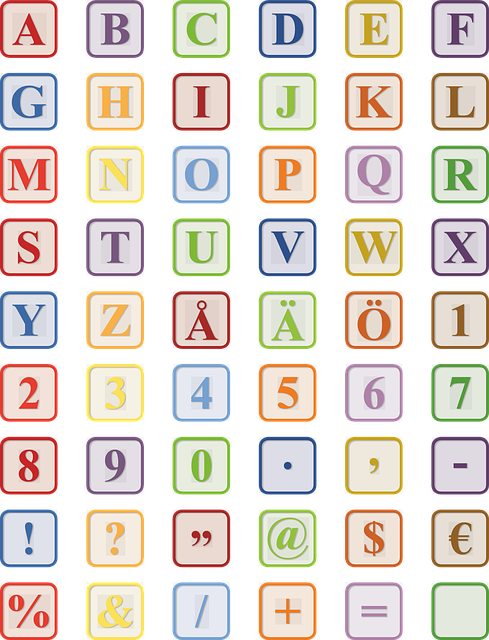
Adding style and personality to your block letters through creative variations and embellishments
One exciting way to bring creativity and personality to your block letters is through unique variations and eye-catching embellishments. By incorporating different techniques and design elements, you can transform your plain block letters into visually stunning works of art.
To start, consider experimenting with different letter shapes and sizes. Instead of the traditional rectangular blocks, try curved edges or tapered ends to add an interesting twist to your letters. You can also play with varying heights and widths to create a more dynamic and visually appealing composition. Don’t be afraid to think outside the box and let your imagination guide you when it comes to your letter shapes.
Another fantastic way to add style and personality to your block letters is through the use of embellishments. Embellishments can range from simple flourishes to intricate patterns and decorative elements that enhance the overall aesthetic of your letters. You can incorporate these embellishments into the main body of the letter or use them as standalone adornments. Embellishments can be created using various techniques such as shading, hatching, or even adding small illustrations within the letters themselves. Remember to keep your embellishments consistent and complementary to maintain a cohesive and polished look.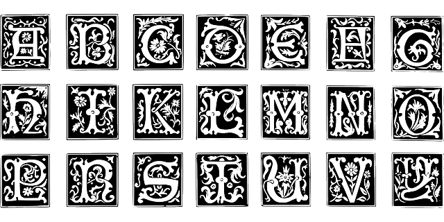
Tips for neat and precise block lettering: Patience and practice
Mastering the art of neat and precise block lettering may seem daunting at first, but with patience and practice, anyone can achieve impressive results. Here are some invaluable tips to help you elevate your block lettering game to the next level:
- Start with a grid: Create a light grid as a guide on your paper using a ruler. This will ensure consistent sizing and spacing of your letters.
- Use the right tools: Invest in quality markers or pens with a chiseled tip for sharper lines. Experiment with different sizes and thicknesses to find the perfect fit for your style.
- Draft lightly: Begin by sketching your letterforms lightly with a pencil. This allows for easy modifications and erasing mistakes later without damaging the final result.
- Practice stroke consistency: Maintain consistent pressure on your pen to achieve even lines throughout your lettering. Gradually increase your pace while practicing to improve control and fluency.
To attain that professional touch and take your block lettering skills to the next level, remember to:
- Focus on spacing: Pay attention to the gaps between each letter, ensuring they are visually balanced. Adjusting spacing can greatly enhance the overall look and readability of your block lettering.
- Refine letter proportions: Practice different letter heights, widths, and angles to find what suits your desired style. Consistency in proportions will ensure harmonious and visually pleasing lettering compositions.
- Experiment with embellishments: Once you’ve mastered the basics, don’t be afraid to add your personal touch. Play with serifs, shadows, highlights, or other decorative elements to make your block lettering truly stand out.
Frequently Asked Questions
Q: What is block letter writing?
A: Block letter writing refers to a style of handwriting in which each letter is composed of clear, distinct, and perfectly straight lines. The letters are typically written in uppercase (capital) form, creating a bold and impactful appearance.
Q: Why should I consider learning how to write in block letters?
A: There are several reasons why learning how to write in block letters can be beneficial. Firstly, it enhances the legibility of your handwriting, making it easier for others to read. Additionally, block letters can give your writing a professional and refined look, whether you are creating signs, designing invitations, or simply taking notes. Lastly, learning block lettering can also be a fun and creative outlet that allows you to add a personal touch to any project.
Q: How can I start practicing block letter writing?
A: To start practicing block letter writing, you’ll need some basic supplies such as lined or grid paper, a pen or marker with a broad tip, and a quiet space where you can concentrate. Begin by starting your practice sessions with uppercase letters since they are generally easier to master than lowercase ones. Take your time to carefully draw each letter, ensuring that the lines are straight and even. It’s essential to practice regularly and gradually increase the complexity of your letters.
Q: Are there any specific techniques or rules to follow while writing in block letters?
A: Yes, there are a few key techniques and rules to keep in mind when writing in block letters. First, maintain consistent letter spacing by leaving an equal amount of space between each character. This will make your writing more aesthetically pleasing and balanced. Secondly, focus on creating the same line thickness throughout each letter. Using uniform line weight will give your writing a polished and professional appearance. Lastly, pay attention to the proportions of each letter, making sure they are well-balanced and symmetrical.
Q: How can I make my block letter writing more stylish?
A: While block letter writing is generally associated with its straightforward and clean-cut aesthetic, there are ways to add your personal touch and make it more stylish. Experiment with different letter sizes, slants, or embellishments like serifs to create a unique visual impact. You can also get creative with color choices by using vibrant or gradient hues. However, be cautious not to overdo it, as simplicity and clarity should remain the primary focus of block letter writing.
Q: Are there any online resources or tutorials available to enhance my block letter writing skills?
A: Absolutely! There are numerous online resources and tutorials available that can greatly assist you in improving your block letter writing skills. Websites such as YouTube, Skillshare, or even specialized calligraphy websites often provide step-by-step tutorials and demonstrations. These resources can offer valuable tips, techniques, and inspiration to help you master the art of graceful block letter writing.
Q: Is block letter writing used only for English characters?
A: No, block letter writing can be used to write in any language that utilizes an alphabet system. Regardless of the language, the principles of straight lines, clear spacing, and consistent letter formation remain the same. By mastering the technique of block letter writing, you can enhance the legibility and visual appeal of any alphabetic script.
To Conclude
In conclusion, mastering the art of writing in block letters is a valuable skill that can enhance both clarity and style in your written communication.